
Most shop owners think of interior design as decoration — how the store looks. In retail, design is something else entirely: it is a tool that determines where customers walk, what they notice, how long they stay, and how much they buy.
The difference between a shop that converts browsers into buyers and one that does not is rarely the products. It is usually the layout. This guide covers the principles that professional retail designers use, adapted to the realities of shops in Dhaka and across Bangladesh — where floor plates are often small and rents are high, making every square foot count.
The First Five Feet: The Decompression Zone
When customers enter a shop, they do not immediately start shopping. For roughly the first five to fifteen feet, they are adjusting — to the light, the temperature, the sound, the layout. Retail researchers call this the decompression zone, and it has a practical consequence:
Anything you place in this zone is largely invisible. Products here get ignored. Signage here goes unread. Promotional displays here waste their position.
In small Bangladeshi shops, where floor space is precious, the instinct is to fill every inch including the entrance. This is a mistake. Keep the entrance relatively open, let customers arrive properly, and place your important merchandise just beyond this zone where attention actually begins.
Customers Turn Right
In markets where people drive on the left and walk on the left, customer movement patterns differ from Western retail research — but the underlying principle holds: customers consistently favour one direction on entering, and in most Bangladeshi retail environments they drift right and then move counter-clockwise around the space.
This has a direct design implication. The wall immediately to the right of the entrance is your power wall — the first surface customers properly see. It should carry your strongest merchandise: new arrivals, seasonal collections, high-margin items, or whatever you most want to sell.
Observe your own shop for a day and note which way customers actually turn. Then arrange accordingly. This single adjustment costs nothing and changes what customers encounter first.
Choosing the Right Layout for Your Shop Type
Grid Layout — for super shops and grocery
Long parallel aisles with products on both sides. It is efficient, familiar, maximises product density per square foot, and lets customers find items quickly. This is why every super shop in Dhaka uses it. The trade-off is that it feels functional rather than exploratory — customers get what they came for and leave.
Design levers that matter here: aisle width (too narrow creates the "butt-brush" effect where customers abandon a shelf because others keep bumping past), end-cap displays at aisle ends for high-margin promotion, and clear overhead category signage.
Loop or Racetrack Layout — for showrooms and department stores
A defined path guides customers through the entire store before reaching checkout. This maximises product exposure — customers see far more merchandise than they would in a grid. It works well for furniture showrooms, department stores and larger fashion retail.
Free-Flow Layout — for boutiques and fashion
Displays arranged without a fixed path, encouraging browsing and discovery. This suits smaller, higher-margin fashion and lifestyle retail where the experience matters more than efficiency. It demands stronger visual merchandising, because there is no path doing the work for you.
Sight Lines: What Customers Can See From the Door
Stand at your entrance and look in. What you can see is what customers can see — and what they cannot see effectively does not exist.
- Keep fixtures low near the front and taller towards the back, so the depth of the shop is visible from the entrance.
- Create a focal point at the back — a feature wall, a lit display, a strong colour. This pulls customers deeper into the space rather than letting them browse the front and leave.
- Avoid tall fixtures blocking the centre. A shop that appears smaller than it is loses customers before they enter.
Eye Level Is Buy Level
Merchandise placed between roughly 1.2 and 1.6 metres from the floor sells substantially better than product above or below it. This is the natural sightline of a standing adult.
- Eye level: your highest-margin and best-selling products
- Just below eye level: supporting products and larger items
- Lowest shelves: bulk, heavy or budget items customers will deliberately look for
- Above eye level: display, branding and visual merchandising rather than products you need to sell
In children's product retail, this rule shifts downward — because the person you are actually persuading is shorter.
Speed Bumps: Slowing Customers Down
Customers who move slowly buy more. Retail designers deliberately interrupt movement with what are known as speed bumps — a display table in a walkway, a change in flooring material, a shift in lighting, a striking display that breaks the visual rhythm.
Each interruption creates a pause, and each pause creates an opportunity to notice something. In a small shop, one well-placed central display table can meaningfully change how long customers stay.
Where to Put the Checkout Counter
The checkout is not just a transaction point — it is prime retail space, because every customer passes it and many wait there.
Position it so that customers walk past merchandise to reach it, typically towards the front-left of the shop if customers enter and turn right, so it sits at the natural end of their loop. Keep the surrounding area clear enough to prevent queue congestion, and use the counter zone for small, low-consideration impulse items.
The staff position also matters: the counter should give a clear view across the shop for both service and security.
Fitting Rooms in Fashion Retail
Customers who enter a fitting room are dramatically more likely to buy. Two design decisions follow from this:
- Place fitting rooms towards the back so customers walk through merchandise both ways.
- Invest in the fitting room itself. Good lighting — warm, front-facing, never harsh overhead — a proper mirror, a hook, a seat and adequate space. Poor fitting rooms lose sales that were already almost made.
Lighting: The Most Underrated Sales Tool
In retail, lighting does more than illuminate. It directs attention, defines mood, and makes products look worth buying.
- Ambient lighting provides overall brightness so the shop feels open and welcoming from the street.
- Accent lighting — track spots and focused fixtures — highlights specific products and display zones. This is where merchandise starts to look premium.
- Task lighting serves the counter, fitting rooms and any area needing detail visibility.
- Colour temperature matters more than most owners realise. Warmer light flatters fashion, textiles and skin tones; cooler, neutral light suits electronics, groceries and technical products.
A shop lit only by flat overhead tubes looks like a warehouse regardless of what it sells. Layered lighting is often the single highest-return investment in a small retail fit-out.
Designing for Small Shops — The Dhaka Reality
Many retail spaces in Dhaka's markets and commercial buildings run between 200 and 600 square feet. The principles above still apply, but the execution changes.
- Go vertical. Wall-mounted, floor-to-ceiling display systems multiply capacity without consuming floor area.
- Use modular, movable fixtures so the layout can be reconfigured for new seasons and collections without renovation.
- Use mirrors deliberately. They double perceived depth — but avoid placing them where they merely reflect clutter.
- Keep the palette restrained. In a small shop the merchandise should provide the colour; the interior should recede.
- Protect circulation. The temptation to add one more rack is strong, but a shop customers cannot move through comfortably is a shop they leave.
Common Retail Design Mistakes
- Overcrowding the entrance — filling the decompression zone with product that customers never register.
- Aisles that are too narrow — customers physically avoid shelves where they get bumped.
- No focal point — nothing draws customers past the front third of the shop.
- Flat, uniform lighting — every product gets equal attention, which means no product gets attention.
- Fixed, permanent fixtures — the layout cannot adapt as the product mix changes.
- Ignoring the shopfront — the facade and window are what convert passers-by into visitors, and they are often the last thing budgeted for.
Seeing These Principles Applied
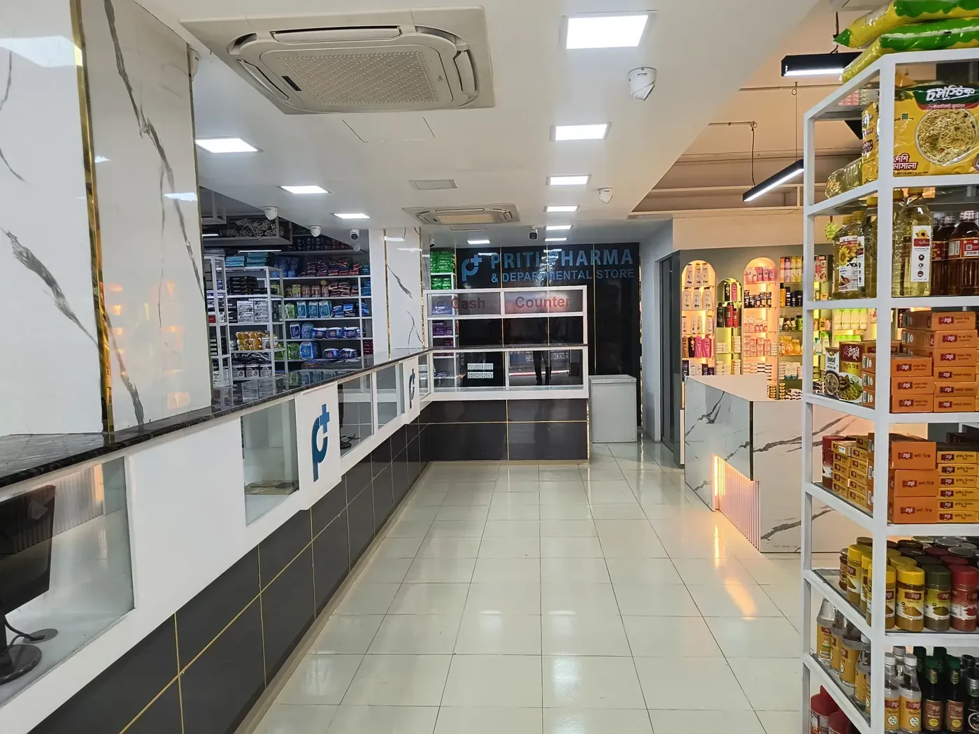
Interior Villa has designed retail environments across Bangladesh, from compact fashion outlets to full departmental stores. Our fashion showroom in Wari demonstrates how a 480 square foot space uses vertical display systems, guided circulation and layered lighting to feel far larger than its footprint. Our Priti Pharmacy and departmental store project shows grid-layout planning, category zoning and customer-flow management in a high-traffic retail environment.
Explore our retail shop interior design and brand showroom interior design services, or browse more completed commercial projects.
Planning a shop or showroom? Book a free consultation — our team will assess your space, product mix and customer profile, and propose a layout designed around how people actually shop.
Frequently Asked Questions
What is the best layout for a small retail shop?
For shops under roughly 600 square feet, a free-flow or simplified loop layout usually works best, combined with vertical wall-mounted display systems to maximise capacity without consuming floor space. Grid layouts suit grocery and super shops where product density and quick navigation matter most.
Where should the checkout counter be placed in a shop?
Position the counter so customers pass merchandise to reach it — typically at the natural end of the customer's path through the store. Keep enough clear space to prevent queue congestion, and ensure staff have a clear view across the shop.
How does lighting affect retail sales?
Lighting directs attention and determines how products are perceived. Layered lighting — ambient for overall brightness, accent lighting to highlight key merchandise, and task lighting at counters and fitting rooms — makes products look more appealing than flat overhead lighting alone. Warmer tones suit fashion and textiles; cooler tones suit electronics and groceries.
How wide should shop aisles be?
Aisles need enough width for two customers to pass comfortably without contact. Narrow aisles cause customers to avoid shelves entirely — a well-documented retail effect. Exact width depends on shop type and expected footfall, and should be confirmed at the layout planning stage.
What is the most common retail design mistake?
Overcrowding — particularly at the entrance and in circulation space. Adding more fixtures feels like adding more selling capacity, but it reduces how comfortably customers can move and browse, which lowers both dwell time and sales.